Past 50, the right color can lift the face in seconds, and the wrong one can drain it just as fast. Stylists keep pointing to the same culprits: harsh black up by the face, murky beiges, flat ash gray, neon brights, icy pastels and stark white. The trick is not to fear color, but to tweak the intensity and temperature so the complexion reads fresh, not tired.
The shift has a simple root. Skin and hair change with time, and so does how eyes read contrast. The American Academy of Dermatology notes collagen production declines about 1 percent per year starting in the mid 20s, which softens facial contours. The National Eye Institute has reported age related declines in contrast sensitivity and color discrimination. Translation in the mirror: extreme contrasts and chalky tones can overwhelm, while nuanced colors feel more harmonious.
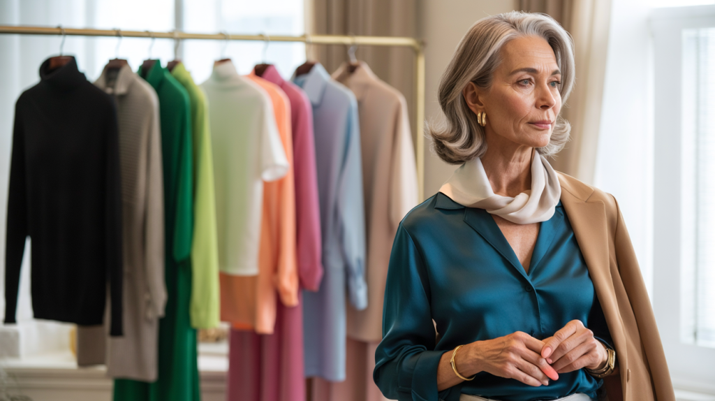
Colors to avoid after 50 according to stylists
Stylists flag a pattern rather than strict bans. Jet black right under the chin can cast hollows and shadows, especially if hair has lightened. Muddy beige that sits too close to the skin tone turns the face sallow. Cool, dusty gray with no warmth can flatten silver hair. Neon brights steal the spotlight from features instead of supporting them. Icy pastels and optic white can look clinical against mature skin that has less surface brightness.
None of these are off limits forever. Placement matters. A black trouser is timeless, while a black crewneck under the chin is less forgiving. The same goes for highlighter pink. It can be dazzling as a bag or a shoe, just not as a full blouse near the face without balance.
Color trends also move. Pantone named “Peach Fuzz 13 1023” as Color of the Year for 2024 in December 2023, a soft velvety peach that many stylists embraced because it boosts warmth without shouting. That direction hints at what works now: gentle saturation, a touch of warmth, and cleaner mid tones that energize rather than compete.
Why color behaves differently on skin after midlife
There is physiology behind the fashion advice. With collagen dipping roughly 1 percent each year, facial structure looks softer and light bounces differently on the skin surface. Bright white and hard black exaggerate edges and shadows, which can emphasize fine lines. Colors with a whisper of warmth often add back the natural radiance that used to come from bounce light on firmer skin.
Visual perception also shifts. The National Eye Institute explains that the lens inside the eye tends to yellow with age, which subtly changes how blues and cool tones appear. That is one reason cool, icy colors can feel dull, while warmer or clearer colors read more vivid and flattering. None of this dictates taste, it simply explains why the old favorite blazer suddenly looks severe.
Hair plays a role. When hair transitions to gray or silver, the overall personal contrast drops. Keeping clothing contrast moderate restores harmony. That means choosing softer navy over inky black, creamy ivory over electric white, and lively mid level color over neon.
The expert backed palette shift that flatters
Stylists often recommend moving from extremes to refined mid tones. Softer alternatives keep impact but flatter skin, eyes and hair. The goal is lift, not loudness.
- Swap jet black near the face for deep navy, charcoal with a hint of brown, or espresso.
- Trade muddy beige for camel, biscuit, or warm taupe that is one or two steps away from your skin.
- Replace flat ash gray with pewter, silver gray, or greige that carries a drop of warmth.
- Dial down neon brights to saturated jewel tones like teal, raspberry, or emerald.
- Switch icy pastels to creamy versions: soft peach, blush, powder blue with a warm undertone.
- Use optic white sparingly and lean on ivory or ecru for tops and scarves.
- If hair is silver, add a color accent near the face to prevent washout, even a thin scarf works.
A quick proof test can be done at home. Stand by a window at midday with a mirror. Hold a white tee, then an ivory tee under the face. If the white shows every line and the ivory smooths everything, there is your answer. Five minutes, zero guesswork.
Real world styling moves and smarter shopping after 50
Start with placement. Keep the trickiest shades away from the face. Love black. Anchor it on the lower half. Add a colored top and a light scarf to break the shadow line at the neck. This single move softens the effect without losing polish.
Work contrast. If hair is light, aim for medium contrast outfits. If hair is dark, increase contrast slightly with brighter mid tones, not neon. Prints help. A floral that mixes ivory with teal and coral distributes color around the face, which often looks more alive than a flat block of neon.
Lean on texture and sheen. Matte fabrics mute color, while soft sheen returns light to the skin. Satin trim, a silk blend tee, a fine gauge knit. Small tweaks that act like a filter. Lip color counts too. A lipstick that echoes the rosy tone in a blouse ties the look together with no extra accesories.
When buying, check the garment under different lights and near the face. Photograph it in daylight. Quick reality check. If a color or white makes teeth look yellower, shift to a warmer family. If a gray makes hair look dull, choose one with a subtle beige cast.
Age never bans color. It refines it. With small edits to undertone, depth and placement, clothes stop fighting the face and start lighting it up. The palette becomes more intentional, less extreme, and far more flattering.