Cloud Dancer Pantone sets the tone
Clicked for palette ideas that actually work with Cloud Dancer Pantone. Good call. This soft white reads airy, modern and quietly warm, which is exactly why it anchors layered interiors without stealing the show.
Designers reach for it because Cloud Dancer behaves like a clean canvas while still feeling human. It softens saturated hues, cools brassy elements, and makes natural textures pop. Think of it as the calm eye of the storm where colors breathe and materials look expensive.
What Cloud Dancer Pantone is, in plain English
Pantone’s system has guided designers since 1963 according to Pantone. Cloud Dancer sits in the off white family, a touch warmer than paper white, less creamy than ivory. On textiles and digital mood boards, it frames colors without turning chalky.
Context matters. Under warm bulbs, Cloud Dancer leans cozy. Under cool daylight, it skews crisper. That is the secret to its versatility in fashion and interiors alike. It feels neutral yet alive.
If you compare whites by light reflectance, paint brands explain Light Reflectance Value on a 0 to 100 scale, where 0 is black and 100 is a perfect reflector, source : Benjamin Moore. Cloud Dancer style whites typically sit high on that scale, which means more bounce light and an airy effect when walls and ceilings use a similar tone.
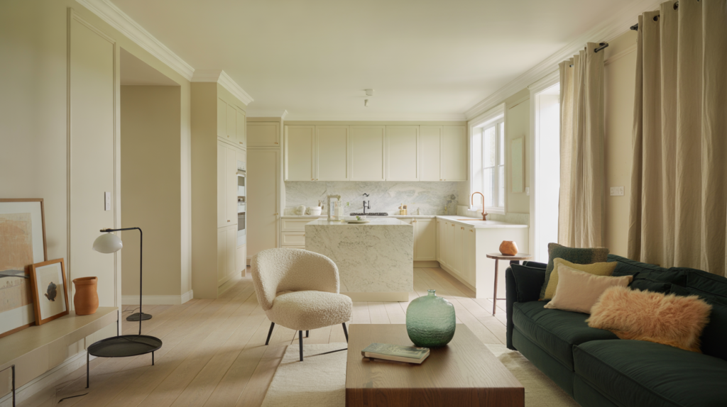
Winning color associations with Cloud Dancer Pantone
The main idea : use Cloud Dancer to balance temperature and contrast. Warm woods love it. So do cool greens and deep blues. Black accents turn graphic instead of harsh next to this white.
Common mistake is pairing it with stark, bluish whites that make it look dirty. Another misstep is loading too many mid tones so the room turns beige on beige. Give Cloud Dancer a couple of clear contrasts and it sings.
Lighting changes everything. For living spaces, the Illuminating Engineering Society recommends warm white light in the 2700 to 3000 K range for ambient use. For task zones, 3500 to 4000 K shifts crisper. The U.S. Department of Energy notes the Color Rendering Index runs from 0 to 100, and fixtures rated 90 plus help whites and colors read true. Those numbers decide whether Cloud Dancer feels creamy or fresh at different hours.
Rooms, materials and finishes that love Cloud Dancer Pantone
Kitchens first. White cabinetry has remained a crowd favorite across renovation studies in recent years, and Cloud Dancer style walls keep stainless appliances and veined stone honest without glare. Brass, aged or brushed, looks intentionally warm beside it.
In bedrooms, pair with soft textiles like linen and bouclé to add shadow and depth. In bathrooms, matte Cloud Dancer on walls next to glossy tile prevents the space from feeling clinical. Art galleries often paint trim and ceilings close to wall tone so frames and canvases sit upfront.
Try a ceiling in Cloud Dancer with walls one step deeper in the same family. The eye reads unity while crown and base keep their crisp edge. Floors in oak or walnut give the palette a grounded base so the white never floats away.
Practical palettes, pro tips and mistakes to dodge
Before jumping in, test large samples on two walls and watch them across morning, noon and evening. Color temperature shifts are real, and Cloud Dancer is honest about them.
- Scandi calm : Cloud Dancer walls, pale oak, warm gray textiles, a touch of black metal
- Desert modern : Cloud Dancer, terracotta, sand, aged brass, raw linen
- Coastal fresh : Cloud Dancer, sea glass green, soft navy, bleached wood
- Gallery soft contrast : Cloud Dancer, deep bottle green, walnut, matte black frames
- Monochrome warm : Cloud Dancer, chalky ivory layers, nubby bouclé, brushed nickel
Actionable steps : define your hero material, pick a temperature family, then let Cloud Dancer bridge the gaps. If your stone countertop runs cool, introduce a warm wood stool and let the white tie them together. If your sofa is earthy, bring in a cool green throw and let Cloud Dancer hold the peace.
Two more guardrails. Do not chase pure optical white trim against Cloud Dancer walls. Keep trims either identical or a whisper brighter to avoid a mismatched edge. And watch sheen. Walls in eggshell, trim in satin, ceilings in flat creates a subtle ladder of light that flatters texture and color pallete without glare.
One last note on trend timing. Pantone named Peach Fuzz as Color of the Year 2024, and this gentle apricot sits beautifully next to Cloud Dancer in textiles and small accents. The mix feels current without shouting.