Open a closet, a design app, a meeting room, and mood quietly tilts. Color is not magic, yet science keeps showing measurable effects on arousal, attention and even performance. That is why marketers obsess over palettes and why a bedroom that once felt cozy now feels restless.
The core idea is simple. Different hues, and the way they are lit, cue the brain to approach or to avoid, to relax or to speed up. Research links red with alertness and caution, blue with calm and creative thinking, green with restoration. Light adds another layer, shifting sleep hormones and setting a daily tempo. The intent here is clear, use what is known to feel and work better.
Color Psychology 101: What Science Says About Mood
Across sports, design and cognition, some patterns repeat. In Nature in 2005, Russell Hill and Robert Barton analyzed the 2004 Olympic combat sports. Competitors wearing red won more often, around 55 percent, hinting at a small but real advantage in high arousal contexts.
In Science in 2009, Ravi Mehta and Rui Zhu reported that red tends to boost detail oriented performance while blue favors creative problem solving across lab tasks. This fits a broader framework described by Andrew Elliot and Markus Maier in the Annual Review of Psychology in 2014, where red signals risk and avoidance, and blue supports open, exploratory behavior.
Brightness and saturation matter too. A classic 1994 paper by Patricia Valdez and Albert Mehrabian found that higher saturation raises arousal while greater brightness nudges feelings in a more positive direction. Not a trivial detail, a muted red whispers differently than a vivid one.
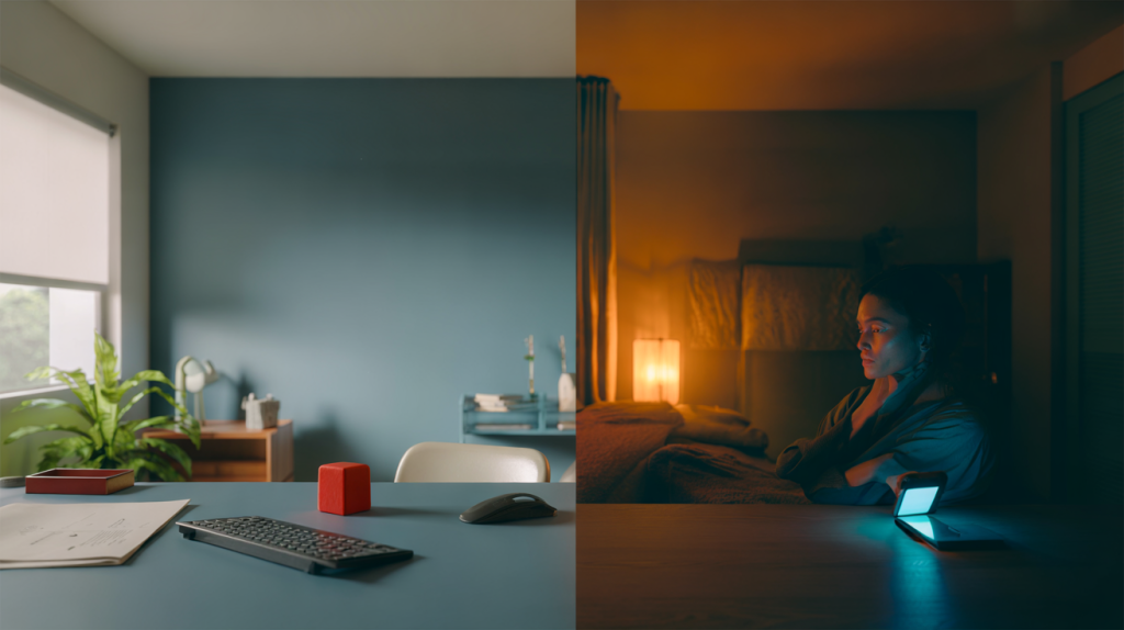
Everyday Triggers: Blue Light at Night, Wall Paint by Day
Light timing can outweigh paint. Harvard Medical School reported in 2012 that, in one lab trial, exposure to blue light suppressed melatonin and shifted circadian rhythms about twice as much as green light at the same brightness. That late night scroll does not just wake the eyes, it tells the clock to delay sleep.
Built spaces also nudge physiology. In Color Research and Application in 2009, Gunnar Küller, Byron Mikellides and Jeroen Janssens observed that warm toned rooms elevated arousal markers in office like settings, compared with cooler palettes. Small but consistent shifts in heart rate and alertness shape how long people can stay focused or unwind after a deadline.
Marketing taps the same levers. A review by Satyendra Singh in 2006 noted that consumers often form a subconscious judgment about a product within 90 seconds, and that 62 to 90 percent of that snap judgment can relate to color. That is a big slice of persuasion before a single feature is read.
Practical Guide: Using Colors to Lift Focus, Calm or Energy
Real life is messy. Attention dips at three in the afternoon, a child struggles with homework, sleep drifts later each week. Small color and light tweaks help, without repainting the entire home.
Start with purpose, then pick the tone and the light that serve it. One size does not fit all rooms or moods. A quick map can save time and regrets.
- Need calm : lean into soft blues and blue greens with matte finishes, pair with warm white light in the evening to avoid melatonin delays.
- Need focus on details : use controlled reds or warm accents near the task area, keep light neutral and bright in the morning hours.
- Need creative flow : add desaturated blues and teals, introduce daylight or high color rendering lamps to keep hues honest.
- Need recovery : green plants and mid brightness greens aid visual rest, step outside for real daylight to reset the clock.
- Screens at night : switch devices to warmer modes after sunset, keep displays dim, consider amber tinted glasses if late work is unavoidable.
A concrete example. In a small studio, paint the wall behind the desk a muted blue, keep the desk accessories neutral, add a small red object within the visual field only for heads down tasks, then move it out of sight later. Dim the table lamp after dinner and avoid overhead glare. The sequence guides the day, not just the style.
Limits, Context and Culture: Why One Shade Does Not Fit All
Color does not act in a vacuum. Culture, past experiences and industry norms can flip meanings. White reads clinical in one setting and pure in another. Red can signal luck in Shanghai and a stop sign in Paris.
Context within the hue also steers mood. Saturation raises arousal, brightness leans positive, as shown by Valdez and Mehrabian in 1994. That means a bright pastel blue can feel lighter than a dark navy, even though both are blue.
The chain is not destiny. If a person associates yellow with a difficult school room, the usual cheer may not land. Test, then adjust. Take a week, swap lamp bulbs, pin up large color sheets before painting, track sleep and focus. Patterns appear quickly, and small tweaks compound. It is definitly a design choice, but first it is a behavior choice guided by solid clues.