2026 Interior Color Trends: What Changes At Home
Color is shifting again, and this time the move feels deeply human. Early signals from leading paint brands and trend agencies point to 2026 palettes that soothe without slipping into bland, then dial up character with richer accents. Think grounding neutrals that warm a room at first glance, elevated greens pulled from gardens and parks, and blues that read intelligent rather than icy.
The context lands fast. People still spend about 90 percent of their time indoors, according to long standing U.S. Environmental Protection Agency findings, so color now carries a wellness job as well as a style one. Pantone’s 2024 choice, Peach Fuzz, cast a gentle glow. Behr went almost-black with Cracked Pepper in 2024. Benjamin Moore leaned into Blue Nova 825 the same year, while Sherwin-Williams named Upward, a buoyant blue. Add WGSN and Coloro’s 2025 pick, Future Dusk, a moody blue violet announced in 2023, and the path for 2026 is clear enough: warmth where we rest, depth where we think, nature where we recharge.
Earthy Neutrals and Soft Pastels: The Quiet Luxury Palette
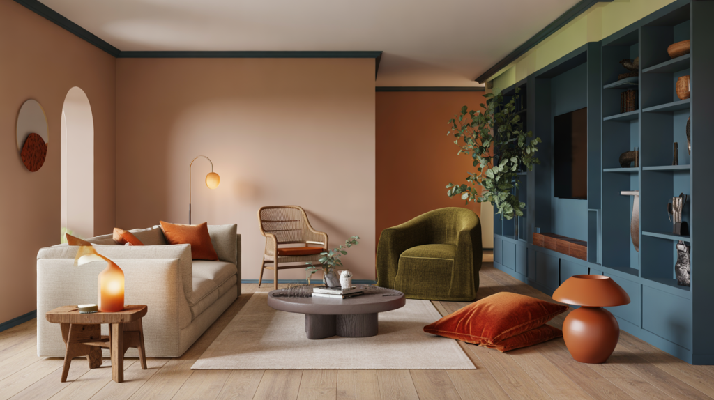
The big idea arrives in the living zones. After years of bright whites, rooms look better with soft light-catchers: linen, oyster, mushroom, latte, and peach-tinted beige that flatters skin and wood. Dulux’s 2024 tone Sweet Embrace already sketched this direction with a tender, misty pink. These hues tame glare, calm open spaces, and make thrifted woods feel intentional rather than mismatched.
There is a practical upside too. Low-contrast backdrops hide scuffs, pair with both cool and warm metals, and let bolder art breathe. The common mistake is going too cold. If the floors are oak, skip stark gallery white and test a creamy neutral with a drop of red or yellow. Sample boards help, and so does watching paint through a full day of light, from morning to lamp hour. A hallway or entry often becomes the perfect test field.
Greens and Blues Get Deeper: Nature and Ocean Tones With Purpose
Greens carry the biophilic brief. Sage and eucalyptus still rule for bedrooms and baths, while moss and olive set a thoughtful mood in dining rooms. Grounded greens pair easily with terracotta tile and rattan, so updates can be refresh not redo. Data tracks the logic. Pinterest’s annual forecasting program reports that 80 percent of its predictions typically come true across the past editions, which keeps nature-led shades near the front of designers’ moodboards because search behavior keeps pointing there.
Blues turn more saturated, brainy, ready for work. Benjamin Moore’s 2024 Blue Nova and WGSN Coloro’s Future Dusk signaled that smart, inky blues are not just nautical. They add focus to studies and media walls and they flatter stone or concrete. Behr’s near-black Cracked Pepper showed how dark can read crisp rather than gloomy when trim stays light and fabrics stay tactile. The miss to avoid is pairing cool blue with blue-ish lighting. Bring in warm LEDs and one touch of tan, and the whole scheme settles.
Accents With Heat: Spice, Clay and Just-Right Black
Accent shades in 2026 have a job, not just a vibe. Terracotta, paprika, and sienna bring a pulse to otherwise quiet rooms. A clay lamp, a paprika velvet cushion, a single painted inside of a bookshelf, that is often enough. Peach notes keep showing up as a healthy glow on textiles and plaster, a ripple of Pantone’s 2024 move without copying it. Black shifts to soft charcoal on doors and frames, which sharpens lines without feeling strict.
Small spaces love this treatment. A powder room in olive with a spice ceiling, a kitchen island in deep blue beside warm mushroom walls, those combinations hold up when trends rotate. The trick is proportion. Let the neutral carry most of the volume, then layer two accents, one earthy and one cool, to balance temperature. A paint pallette set like that forgives seasonal swaps.
How to Use 2026 Home Color Trends: Rooms, Finishes, Balance
Ready to try the palette at home, step by step, no drama.
- Start with one anchor neutral for shared spaces, then choose one green and one blue for depth. Test three samples per room, on two walls.
- Use matte or flat on ceilings for softness, eggshell on walls for wipeability, satin on trim for a crisp edge.
- Bring in one spice accent through textiles or a single panel rather than four walls. Adjust with pillows, throws, art if the tone feels loud.
- Warm the scheme with wood, clay, or rattan, then add one metal only, either brass or blackened steel, to avoid visual noise.
- Check colors at night under warm LEDs, then again at noon. If a shade turns gray at night, shift one step warmer.
Why this lands for 2026 makes sense in the numbers and the launches. Pantone’s Peach Fuzz arrived in December 2023 as a comfort signal, Behr and Benjamin Moore balanced that softness with deeper statements in 2024, and WGSN Coloro pointed to duskier blues for 2025. Taken together, the direction is cohesive, not random. Rooms feel lived in, healthier, more sale-ready without falling into safe beige. The missing piece is always scale, so plan the neutral to accent ratio before buying paint, then build textiles and lighting to support the palette rather than compete with it.