Why Flyers Promoaccro Still Win Attention Fast
Scroll fatigue is real, but a well-timed flyer lands in a hand, on a fridge, or in a pocket. That tiny moment of physical contact often beats another forgettable swipe. Flyers Promoaccro step into that gap : practical print that captures attention on the street and converts nearby customers who are ready to act.
Context matters. Local launches, weekend offers, events, new menus, seasonal deals – these live or die on proximity. A compact A6 or A5 flyer with a sharp headline and a scannable QR code gets someone from sidewalk to checkout in minutes. This is not nostalgia. It is channel fit.
Promoaccro Flyers : Clear Problems Solved, Right Now
The main idea is simple : people need directions and a reason to move. Flyers excel at three jobs most digital ads struggle to do locally – precise location nudges, quick offer framing, and tactile reminders customers can keep. Add a map pin, hours, and one crisp call to action, and the path is obvious.
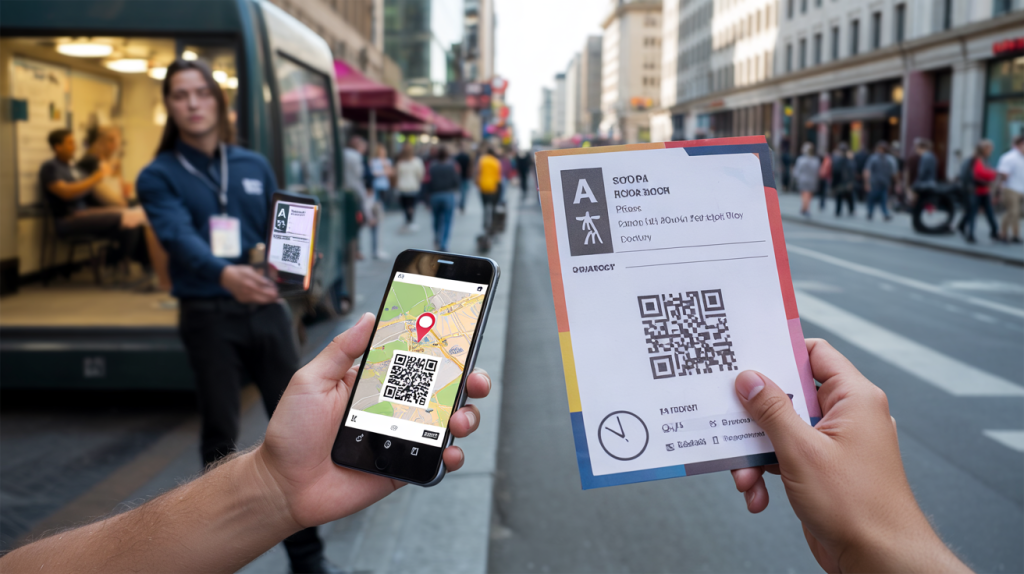
A frequent miss appears earlier than design : format. ISO 216 sizes keep production efficient and predictable. A5 measures 148 x 210 mm and, by design, halves from A4 while keeping aspect ratio, a 50% area step each time (ISO 216 : 1975). That keeps costs sane and stacks neatly on counters.
Then comes measurability. QR codes, invented by Denso Wave in 1994, include error correction up to 30% so they remain scan‑friendly even when smudged or folded (Denso Wave, 1994). Tie each drop to a unique UTM link and the return stops being a mystery.
Design, Print, Distribution : What Works In The Wild
Common mistakes are painfully consistent : too much text, unclear offer, no scan path, and zero hierarchy. Big headline. One benefit. One action. That order. A real example that keeps performing in busy neighborhoods : “Lunch for 9.90 – 2 streets away – scan for today’s menu.” People move when copy talks like that.
Color and accuracy still matter. CMYK process printing is standard, while spot-matching with Pantone exists since 1963 for critical brand tones (Pantone, 1963). Keep images at 300 ppi for sharp results on offset or digital presses (Adobe Help Center, 2023). Grammage defines paper weight in g/m² under ISO 536, and popular flyer stocks sit around 135 g/m² for easy handout or 170 g/m² for a more premium feel (ISO 536). Small thing, big feel.
Distribution makes or breaks a campaign. Handouts near transit at 8:00, 12:30, and 17:30 hit peak flows. Door-to-door drops boost local reach ahead of weekend promos. Event stacks work when placed by water stations or ticket lines. And never forget the redeem path : QR to a mobile‑ready page, short URL as backup, and a code the cashier can enter fast.
- Keep to one goal per flyer : visit, call, or scan – not all three
- Use A5 or A6 for street work, A4 for posters next to the till
- Add 3 mm bleed and quiet margins so text never clips (Adobe Help Center, 2023)
- Contrast first : black on pale or white on dark for instant legibility
- Place the QR code bottom right, clear space around it, test from arm’s length
How Promoaccro Flyers Turn Into Measurable Sales
The analysis is straightforward : flyers shine when the message is close to the moment of need. Hungry nearby? Ready for a launch tonight? Fixing a last‑minute gift? That is where a low-cost handout outperforms a generic impression.
To lock the loop, connect print to analytics. Use unique QR destinations for each neighborhood or time slot. Because QR codes recover up to 30% of damaged data, scans stay reliable out in the field (Denso Wave, 1994). Tie redemptions to a same‑day incentive – for instance, show the flyer and get a small extra – so staff can validate impact without slowing the line.
Technical prep reduces friction. Export print‑ready PDF/X with vector logos, 3 mm bleed, and fonts embedded; keep total ink below press limits; supply both CMYK and spot color specs if brand colors are non‑negotiable (Adobe Help Center, 2023). Use ISO A‑series : art built to A5 or A6 scales cleanly across other placements (ISO 216 : 1975). And add a real‑world adress line customers can find on Maps, not just a brand name.
Then the last missing piece : timing. Run short bursts that mirror footfall patterns and weather. Sunny Saturday? Push iced drinks or patio dining mid‑morning. Rainy commute? Lead with delivery QR at station exits. Promoaccro can print fast, but the win happens when the flyer appears where intent is warm and the next step takes one scan, not thought.