Forbidden colors after 50 : myth busted, rules rewritten
Clicked in to find the list of colors to ban after 50? Here is the straight answer: there are no forbidden colors. The idea that bright red, black, neon, or pastels suddenly stop working at a certain birthday is a styling myth. What changes is how eyes perceive color and how skin reflects it, which means shade, contrast, and texture matter more than ever.
Two facts set the stage. Vision shifts with age, making some tones look harsher or duller in typical indoor light. At the same time, undertones in hair and skin evolve, so an old favorite may not pop the way it used to. Adjust the color pallette – not your personality. The goal is impact with softness, clarity without glare.
What changes after 50 : eyes, light, and how color looks
The science helps. Sensitivity to short-wavelength hues can drop as the eye’s lens yellows over time, which affects how blues, violets, and some greens appear. The U.S. National Eye Institute notes that by age 80, over 50 percent of Americans have had a cataract or currently have one, a condition tied to that yellowing lens effect that filters color perception (National Eye Institute, 2023).
Lighting compounds the issue. Older adults typically need significantly more illumination to see detail crisply. Color judgment improves under high color-rendering lights, so look for bulbs with a Color Rendering Index of 90 or higher for closets and makeup mirrors. The U.S. Department of Energy points to CRI 90+ as the standard for color-critical tasks in retail and at home (DOE SSL guidance, 2020).
Demographics matter too. The United Nations projects that by 2030, 1 in 6 people globally will be aged 60 or older, reshaping fashion et beauty to serve this majority audience with smarter color design (UN DESA, 2022). Translation: brands are already rethinking shade ranges and store lighting because perception data is not niche – it is mainstream.
Smart color moves after 50 : shades, contrast, prints
The problem most readers want to solve is simple: keep wearing favorite colors while avoiding a washed-out or harsh effect in day-to-day light. Small shifts in shade and contrast do the heavy lifting.
Common pitfall seen in dressing rooms: picking the same hue but in the wrong intensity. Electric cobalt can read stark on cooler skin if the eye is less sensitive to blue. A mid-tone azure, on the other hand, keeps the energy but lands softer in indoor lighting.
Try these evergreen adjustments that work across wardrobes and budgets :
- Keep your hero color, tweak the temperature : cherry red to tomato red for warm undertones, or to raspberry for cool undertones.
- Swap black near the face for deep navy, charcoal, or bitter chocolate. Contrast stays sharp, features look less severe.
- Trade optical white for soft white, ecru, or light stone. The result: brightness without glare on skin.
- Choose saturated mid-tones over neons. Think teal, spruce, merlot, peacock, saffron – vivid but wearable.
- Use prints with a quiet background and crisp accents. A dark-ground floral or a micro-stripe adds life without noise.
- Check fabrics in daylight or under CRI 90+ bulbs. Color reads truer, so decisions stick.
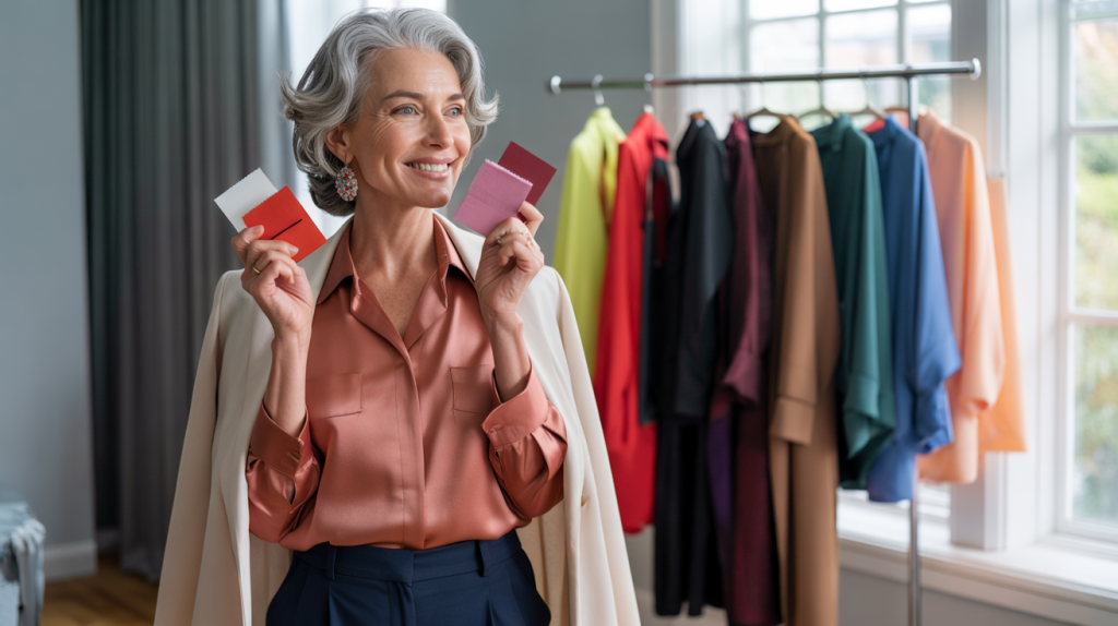
How to wear bright colors after 50 : simple combos that work
There is appetite for color. The question is how to make it feel modern. Start with one statement piece and anchor it to relaxing neutrals. A hot pink cardigan with stone chinos. A saffron blouse with navy trousers. One hero, two supporters.
Peach shades are having a moment. Pantone named “Peach Fuzz 13-1023” as the 2024 Color of the Year, a soft, tactile hue that flatters many undertones without draining them. Warm complexions can push it a touch deeper toward apricot. Cooler skin can layer it with cool-beige or iced taupe to balance warmth.
Blues remain wardrobe MVPs, but pick the right lane. If royal blue feels loud, try French blue or denim blue near the face, then stack contrast through lipstick, frames, or earrings. Short story: let accessories do the sharpening so clothes can stay kind.
One last, practical step that changes outcomes fast. Before buying, take the garment to a window or step outside the store. Natural light behaves like a truth serum. If that is not possible, look for a fitting area lit by high-CRI LEDs labeled 90+. Colors that pass this test tend to work better in everyday life, from office elevators to evening restaurants.
Sources : National Eye Institute – Facts About Cataract ; U.S. Department of Energy – LED Color Rendering ; United Nations DESA – World Population Ageing 2022 Highlights ; Pantone – Color of the Year 2024