ELLE’s style has never stood still. Born in 1945 with a promise of modern, useful fashion, the magazine keeps pivoting to match how we dress, shop, and scroll. From couture silhouettes to shoppable stories, the look changed, the tone eased, the mission stayed sharp : make style feel alive and everyday.
Here is the context that explains the shift fast : ELLE launched in Paris in 1945 under Hélène Gordon-Lazareff, became a weekly reference in France, and expanded globally with a United States edition in 1985. The visual identity was recut in the 1960s by art director Peter Knapp, then pushed into the supermodel era. In December 2021, the brand announced a fur ban across 45 editions worldwide, a turning point linking aesthetics with values. Today ELLE publishes in more than 60 countries while juggling print, video and social formats.
ELLE magazine style : what changed, what stayed since 1945
Main idea first. ELLE pairs style authority with service. That blend starts in postwar Paris, when clothes had to be beautiful and practical. Early issues mixed patterns, budget ideas and couture shots, while the thin serif masthead signalled a fashion point of view. The magazine kept that dual promise : aspirational images, usable advice.
There is a recurring problem readers face : fashion media can look stunning and still feel distant. ELLE’s answer was a warmer edit, a conversational voice, and photography that moves. It reads lighter than the industry’s most formal titles, yet it does not drop standards.
Dates anchor the pivot. Peter Knapp served as ELLE’s art director from 1959 to 1966, then again from 1974 to 1977. He energized grids, cropped images tighter, invited motion into layouts. The United States edition arrived in 1985, with photo director Gilles Bensimon shaping the kinetic gloss that defined late 1980s and early 1990s supermodels. In the early 1990s, editor in chief Jean-Dominique Bauby brought a crisp, culture-aware edit to French ELLE, right before his 1995 accident.
1960s to 1990s : Peter Knapp, the US launch in 1985, and a new visual language
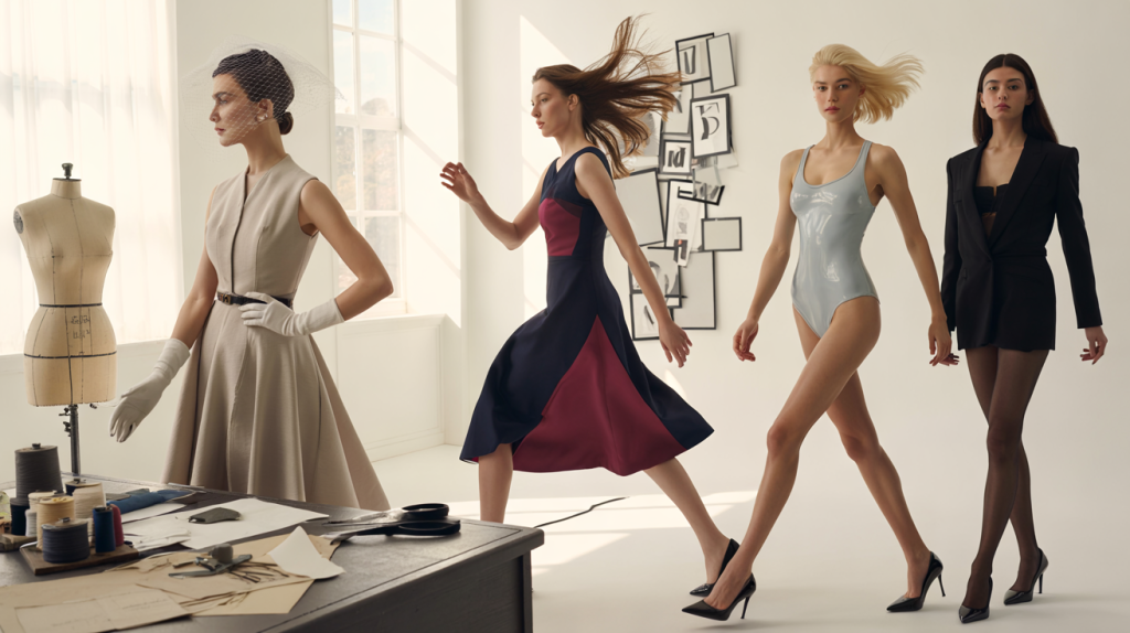
Observation. The 1960s taught ELLE to treat the page like a moving frame. White space grew. Typography went bolder against full-bleed images. The effect made fashion stories feel faster and less stiff, a language that still reads modern.
By 1985, the US edition translated French chic for an American audience hungry for energy. Covers stacked names readers knew by heart. Photographers like Gilles Bensimon and Pamela Hanson helped codify the glossy, athletic look that fueled the supermodel era. Service lines – how to wear, where to buy – sat close to images, not in the back.
Numbers matter to understand influence. The US launch in 1985 accelerated global reach, while the French edition continued weekly in print. Through the 1990s, ELLE bridged runway and street with shopping pages that mirrored real budgets, a move that kept loyalty high during the retail boom.
Digital decade to values : fur ban in 2021 and the platform shift
Readers moved from kiosks to phones. ELLE followed with shorter headlines, vertical video and social-first imagery. The voice adapted : less formal, more useful, friendly without losing authority. Interviews and profiles now land alongside price tags, QR codes, and swipe-ups. Yes, that bold.
The values pivot came with a clear date. In December 2021, ELLE announced a global ban on fur in editorial and advertising across 45 editions, effective from 2022, aligning the brand with a more responsible fashion agenda. That decision reframed the aesthetic : luxury could be ethical and modern without legacy materials.
The business logic is simple. Align visuals with values, and readers stay. Sustainability edits, rental and vintage spotlights, and material explainers now sit inside fashion pages. The tone remains accessible, never preachy, which is why the format lands with audiences who want guidance, not guilt.
How to read ELLE’s style today : signatures, shifts, and what brands borrow
Here is the useful part. The current ELLE look is easy to recognize and, yes, to apply to a feed, a newsletter, a lookbook. It mixes French poise with global pop and keeps a shopper’s lens on every page.
Visual signatures that recur again and again land like a small checklist readers can spot at a glance.
- A thin high-contrast serif masthead that nods to heritage.
- Full-bleed photography with tight crops and visible movement.
- Service headlines built on verbs : wear, layer, shop, decode.
- Clean grids with generous white space and sharp color accents.
- Real-world styling cues : sneakers with tailoring, denim next to couture.
One concrete example : a runway story might open with a portrait shot, follow with three looks on a white page, then switch to a shopping strip that lists prices and stockists. The page rhythm mirrors how people browse : look, pause, decide.
So what is missing if one only sees the pictures. The edit. ELLE’s evolution sits in choices about voice and timing : the big trend piece lands first, the how-to follows, the values angle ties it to daily life. That sequencing – born in print, perfected online – is the reason the brand still feels millenial and fresh in 2025 while staying rooted in 1945 Paris.