Meta description : From sailors to streetwear, discover how the slogan T-shirt became a global voice, with dates, icons and market data that bring the story alive.
The message T-shirt took a simple cotton base and turned it into a loudspeaker. Worn on chests, it rallied crowds, sold cities, and sparked arguments at breakfast. From the very first printed slogans to today’s viral drops, this garment keeps saying what people think, fast and in public.
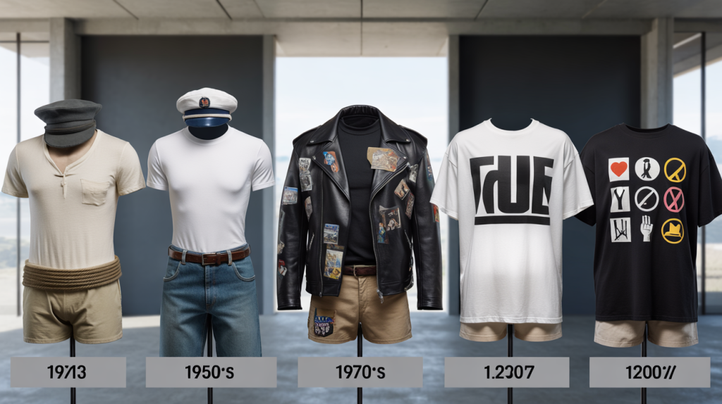
Here is the short version. The T-shirt moved from U.S. Navy underwear in 1913 to outerwear after Marlon Brando’s 1951 turn in “A Streetcar Named Desire”. Licensed graphics grew in the 1950s. Slogans exploded with 1960s activism, then punk graphics in the 1970s and the giant-font statements of the 1980s. The format still thrives. According to Grand View Research, the global custom T-shirt printing market was valued at 3.64 billion dollars in 2020 and is projected to grow at a 9.7 percent CAGR through 2028.
Origins of the message T-shirt : navy roots to mass appeal
Fact first. The U.S. Navy adopted crew-neck cotton undershirts in 1913 for practicality at sea. Sportswear brands pushed them into everyday life through the 1930s and 1940s, cheap and easy to wash. Then came visibility.
A turning point arrived in 1951. Marlon Brando wore a tight white tee on screen, and the T-shirt stopped hiding under shirts. Around the same time, printers like Tropix Togs began licensing characters from Walt Disney in the late 1950s, proving that a tee could carry art, words and identity in one hit.
The 1960s brought screen-printing innovations and youth movements. Students marched in tees printed with antiwar messages, peace signs and campus teams. Printing got faster, colors got bolder, ideas got braver.
Key milestones matter for quick orientation.
- 1939 : The British Ministry of Information created the poster “Keep Calm and Carry On”, rediscovered in 2000 by Barter Books and later adopted on tees worldwide.
- 1977 : Designer Milton Glaser drew “I Love NY” to boost New York tourism, and the red heart on white tees became a global visual shorthand.
- 1983–1984 : Designer Katharine Hamnett’s giant type tees hit pop culture, from “Choose Life” to “58% DON’T WANT PERSHING”, the latter worn to a Downing Street meeting in 1984.
- 2003 : UK charity the Fawcett Society popularized “This Is What A Feminist Looks Like”, tying apparel to policy debates.
- 2017 : Dior sent “We Should All Be Feminists” down the runway, echoing Chimamanda Ngozi Adichie’s 2012 talk and new-wave feminism.
Slogans that shook culture : punk, protest and the eighties megaphone
Punk rewired the medium. In the mid 1970s, Vivienne Westwood and Malcolm McLaren used ripped cotton and provocative prints like “Destroy” or imagery tied to the Sex Pistols to attack the status quo. A tee could offend and seduce on the same night out.
City branding joined in. In 1977, Milton Glaser’s “I Love NY” made a tourist shirt into civic pride and soft power. The formula was simple: a few characters, a clean font, instant recognition on the street and in photos.
Then came the megaphone look. Katharine Hamnett scaled type to billboard size. “Choose Life” arrived in 1983 and jumped into pop through Wham!’s 1984 video. One year later, her “58% DON’T WANT PERSHING” turned polling data into clothing during the missile debate. Politics and retail met in a bright white rectangle.
2000s to now : identity, virality and the message tee
As the web sped up, slogans traveled faster. The wartime “Keep Calm and Carry On” resurfaced in 2000 and mushroomed into infinite remixes by the late 2000s. The template was familiar, the memeability new.
Social movements used cotton as a prompt. The Fawcett Society’s 2003 “This Is What A Feminist Looks Like” put an old label in fresh type. After 2013, Black Lives Matter phrases appeared across marches and small brands. In 2017, Dior’s runway tee amplified a literary line to a mass audience in one show.
Manufacturing adapted. Print-on-demand shops trimmed inventory risk, while short runs let small designers test ideas overnight. Grand View Research’s growth forecast through 2028 points to a simple driver: people keep buying words they relate to.
How to read a slogan T-shirt : context, accuracy and intent
One frequent mistake: mixing a catchy phrase with the wrong era. “Keep Calm” belongs to a 1939 poster, not a social media origin story. Dates matter because they shape meaning.
A practical habit helps. Check the typeface, label and printing method before calling a design “vintage”. Hamnett’s statement tees used oversized block type on crisp cotton. Westwood’s punk pieces often clashed textures and iconography. Provenance gives weight to the message you wear.
Another watchout is data. When a shirt cites numbers, ask where they came from. Hamnett’s “58% DON’T WANT PERSHING” came from polling at the time. Today, a stat tee without a source risks looking hollow, even if the slogan sounds definitly smart.
The logic is straightforward. Slogan T-shirts work when three pieces align: a clear phrase, a moment that needs saying, and a design that photographs well. Add a trusted source when numbers appear, and that cotton square becomes a credible voice in the crowd. If the story behind a message is missing, dig for the year, the author and the first appearance, then decide whether the words deserve your chest today.
