Martin Parr turns kitsch into sharp social photography. Key series, dates, and how to read his neon-soaked images without missing the point.
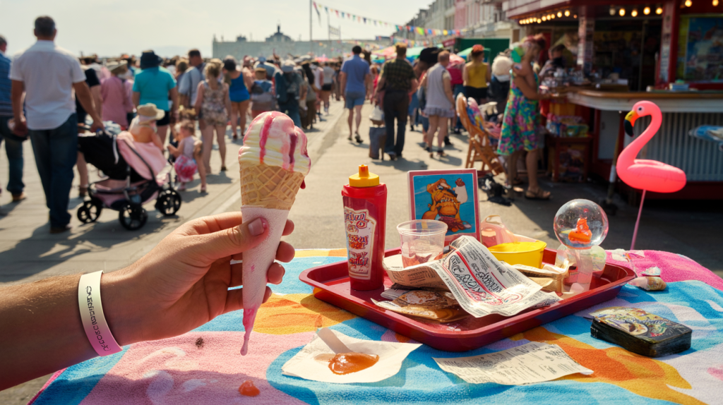
Plastic flamingos, souvenir towels, melting ice creams under harsh flash: in Martin Parr’s frame, kitsch stops being clutter and becomes evidence. The British photographer has spent decades using bright color and close-up detail to document everyday consumption, making the garish feel strangely precise.
Here are the facts that ground that reputation. Martin Parr, born in 1952, joined Magnum Photos in 1994 and served as its president from 2014 to 2017. Landmark series such as “The Last Resort” (1986), “Small World” (1995) and “Common Sense” (1999) fixed his vocabulary of saturated color, ring flash and wry proximity. He has published more than 100 photobooks. In 2014, he founded the Martin Parr Foundation in Bristol, and in 2019 the National Portrait Gallery in London presented “Only Human: Photographs by Martin Parr”.
What kitsch means in Martin Parr’s photography
Kitsch, in Parr’s usage, is a visual strategy. Cheap ornaments, gaudy signage, fast food trays and sunburnt skin form a palette that reveals how people present themselves when leisure and shopping set the stage. The color is punchy because life in these places is punchy.
The method is consistent: get close, keep the flash on, let surfaces speak. Parades, beaches, funfairs and tourist traps provide recurring backdrops. Everything that appears excessive reads as data about taste, identity and aspiration, not a punchline.
That is why the pictures feel immediate. The clutter invites a laugh, then details ask for a second look – a wedding corsage next to a plastic tiara, a souvenir spoon beside luxury packaging. The kitsch items anchor the social clues.
Where kitsch explodes: “The Last Resort”, “Small World”, “Common Sense”
“The Last Resort” appeared in 1986 from photographs made in New Brighton in the mid 1980s. Families gather at snack bars, pastel pushchairs dot the promenade, and litter shares the frame with seaside pleasure. The series is now a reference for late twentieth century British leisure.
“Small World” arrived in 1995, turning to global tourism. Selfie-adjacent before selfies, the project follows guided tours and gift shops from Pisa to Tokyo. Tacky souvenirs and crowded vistas show how travel packages shaped the way monuments get seen.
Then came “Common Sense” in 1999, a full-throttle dive into consumer objects. Parr used macro views and ring flash on lipstick swatches, plastic toys and supermarket goods. The images look glossy, almost sticky, making retail desire visible at the scale of a fingertip.
Facts, places et how to see Martin Parr’s kitsch today
The timeline and the institutions help readers find the work, not just read about it. The Martin Parr Foundation opened in Bristol in 2014 with an adress dedicated to British documentary photography and Parr’s own archive. Magnum Photos has represented him since 1994, and the National Portrait Gallery showcased his UK portraits in 2019 under the title “Only Human”.
Not sure how to read the pictures without getting lost in neon and novelty items? A simple checklist helps.
- Track the flash: strong, frontal light flattens shadows so textures and labels pop.
- Scan edges: Parr often hides key social cues at the frame borders – wristbands, receipts, stains.
- Follow color blocks: reds and yellows often lead to money, food, or branding.
- Note posture: body language carries as much meaning as any prop or pattern.
- Map context: pair series with dates – 1986, 1995, 1999 – to see shifts in leisure and tourism.
How to photograph kitsch without cynicism: takeaways from Martin Parr
The approach is technical and ethical at once. Use color deliberately. On-camera flash in daylight keeps tones crisp and highlights surface culture. Step closer than feels comfortable, but keep eye contact and timing respectful.
Work in sequences. Parr’s images gain force as series, not one-offs. “The Last Resort” reads differently when twenty scenes of snacks, queues and paddling pools speak together across 1986 prints. The repetition turns style into evidence.
Context then does the final lift. Dates, locations and publication history prevent kitsch from floating as pure spectacle. Link an image of a tourist crowd to “Small World” in 1995 and the picture sits within the growth of mass travel in the late twentieth century. Connect a lipstick close-up to “Common Sense” in 1999 and retail display practices come into focus.
For anyone wanting to see the originals, the Martin Parr Foundation in Bristol regularly exhibits prints and hosts talks since 2014. Photobooks remain the most faithful channel to his sequencing logic: “The Last Resort” (1986), “Small World” (1995), “Common Sense” (1999), and the 2019 “Only Human” catalogue align content, color and context in the way the work was designed to be read.