Pantone 2026 white, decoded: what to ask your printer, what to pick for screens, and how to keep packaging crisp without surprises.
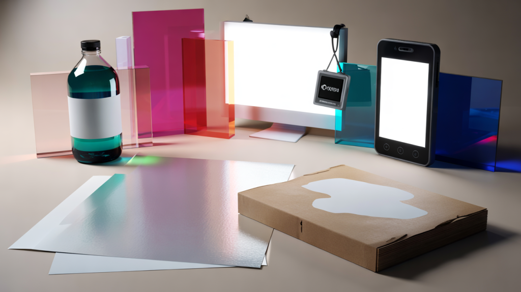
Designers keep typing the same query: “Pantone 2026 white”. Here is the straight answer. There is no single Pantone swatch called Pantone 2026 white. In the Pantone Matching System for graphics, white usually equals the substrate, while a special ink called Opaque White is specified when you need a printed white on colored or transparent materials.
That nuance changes everything. On screen, white is a defined light value, #FFFFFF in HEX and sRGB 255 255 255. In print, white depends on paper shade and finish, unless a spot Opaque White is used. For brand rollouts aiming at 2026, the right approach is to align these worlds early, not to hunt a non existent single code.
Pantone 2026 white in context: what it really means for designers and brands
Pantone launched the Pantone Matching System in 1963 to standardize inks for print, then expanded to Fashion, Home and Interiors for materials like cotton and plastic. White sits differently in each universe, which is why projects stumble when the same word is used for three distinct things.
In PMS for print, “PMS White” is effectively no ink, letting the paper show. For colored stock, clear films or metal, printers specify Opaque White as a spot ink so that type or logos appear as white. In textiles, the FHI system lists several whites by name, since fabrics have their own base tone and reflectance.
Pantone Color of the Year grabs headlines each December. 2023 was “Viva Magenta” 18 1750, and 2024 is “Peach Fuzz” 13 1023. Those announcements are trend signals, not production recipes for white. Anyone planning 2026 launches can use trend context for palettes, then lock production whites with process choices.
Typical mistakes with Pantone white and how to avoid them
Assuming white prints the same everywhere is the fastest way to a mismatch. Paper whiteness varies widely between bright blue white sheets and warm natural papers. The result is a different perceived white without changing ink at all.
Treating CMYK 0 0 0 0 as a color is another trap. That build tells the press to print nothing, which shows the paper. On kraft, it looks beige. On clear labels, it becomes transparent unless Opaque White is added. Packaging teams know the drill, but it still trips fast moving projects.
Screens create white with light, not pigment. The web baseline is sRGB. White equals 255 255 255 and HEX #FFFFFF. If product photography is retouched against that digital white, then printed on warm uncoated paper without Opaque White, halos and dingy edges appear. The fix is planning, not pushing more ink on press.
Market data supports the choice to keep white central. Axalta’s Global Automotive Color Popularity Report has kept white at the top worldwide for more than a decade, roughly one in three new cars in recent years. That staying power shows how consumers read white as clean and premium across categories.
From screen to press to product: steps that make white 2026 ready
Planning ahead removes drama. The workflow below meets brand consistency goals while respecting how white behaves on different substrates.
- Define two whites in your brand specs: digital white as sRGB 255 255 255 and print substrate white described by the exact paper name and finish.
- For packaging on colored or transparent materials, request a spot Opaque White plate and set knockout rules in the artwork to avoid show through.
- Ask for paper white simulations at proof stage. A contract proof on the target stock reduces surprises far better than a generic bright proof.
- Use a controlled viewing light, D50 at 5000 K, when approving print whites. Mixed lighting makes the same sheet shift cool to warm instantly.
- For textiles or plastics, reference Pantone FHI textile or plastic chips for white, then confirm with a production sample since base materials slightly tint the result.
Looking toward 2026: materials, trends, and why white keeps winning
Minimal packaging grew alongside e commerce and direct to consumer brands, then matured. White stayed central while type and micro textures did the talking. The reason is practical as much as aesthetic. White reduces ink coverage, speeds drying, and often improves recyclability when designers avoid heavy flood coats.
Sustainability pressure should keep that trajectory. Fewer inks, lighter boards, and less coating weight all favor a substrate led white. Printers already report faster make readies when large white areas are built into the design, which trims cost and waste on long runs.
On screens, high dynamic range displays pushed brighter whites in product shots and UI. That looks crisp, yet it widens the gap with uncoated paper. Teams that calibrate to sRGB for web and request uncoated friendly print conversions hit fewer snags. Small move, big gain, definitly.
The missing piece is alignment on vocabulary. For 2026 campaigns, replace the vague “make it Pantone white” with three precise asks. Which substrate white for print. Where Opaque White is required. Which digital white for screens. That clarity turns a fuzzy brief into consistent experiences in hand, on shelf, and online.