Pantone Cloud Dancer 11-4201: what it is and why it trends
Looking for a white that photographs softly yet stays crisp at night lighting? Pantone Cloud Dancer 11-4201 brings that airy, breathable off-white many homes et brands keep chasing.
Placed in Pantone’s Fashion, Home + Interiors system, Cloud Dancer reads as a clean, warm-leaning white that reduces glare and strengthens contrast without the clinical feel of pure white. For context: Pantone standardized color with the Pantone Matching System in 1963 (Pantone), and its Color of the Year program has run annually since 2000, with Peach Fuzz 13-1023 announced for 2024 in December 2023 (Pantone Color Institute, 2023). Cloud Dancer is not a trend color-of-the-year pick, but a reliable neutral designers come back to when serenity matters.
How Cloud Dancer solves real problems in rooms and branding
Main idea first: Cloud Dancer softens surfaces and enlarges visual space. It pulls light across walls and fabrics, while still giving shadows a gentle edge.
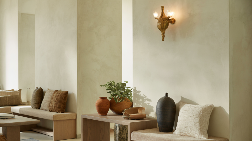
Observation from studios and retail: crisp cool whites can go stark on camera and harsh under LEDs. Cloud Dancer balances that by staying forgiving with skin tones and wood grains. Spaces feel quiet, not flat.
The common problem it tackles is tonal drift between materials. On cotton, linen, matte paint, coated card, the hue sits consistently close, especially in its TCX textile reference within Pantone’s FHI ecosystem. That makes handoffs between print, packaging, and interiors less risky.
Pairings, palettes, and a few mistakes to skip with Pantone Cloud Dancer
Two things trip teams up: pairing Cloud Dancer with very blue-leaning grays that make it look yellow, or pushing it against optic-bright whites that make it read dirty. The fix is simple – keep neighbors warm or truly deep.
In brand palettes, Cloud Dancer absorbs bold shades without stealing saturation. On product shots, it avoids the “white-on-white” vanish because it preserves a trace of contrast along edges.
Real world example: hospitality lobbies layered with Cloud Dancer walls, mid-tone oak, and aged brass read timeless on both phone cameras and DSLR. That cross-device consistency is why many art directors treat it as a base layer, not just a background.
Try these proven combinations for Cloud Dancer 11-4201:
- Warm woods et brass hardware – gives depth and a calm glow for foyers and cafés.
- Earthy clays and terracotta – frames Cloud Dancer so whites do not wash out on social photos.
- Olive to sage greens – biophilic vibe without trend fatigue.
- Charcoal or inky navy accents – strong contrast that still feels soft, ideal for typography over light backgrounds.
- Textural linens, boucle, limewash – adds shadow play so the off-white reads dimensional.
From spec to site: smart use, sourcing notes, and a simple workflow
One clear step-by-step helps teams align color across materials. Start with the Pantone FHI reference for textiles or soft goods, then convert under controlled light to paint and print equivalents. Pantone’s system has supported cross-industry color matching since 1963, which is why production partners still request these codes on briefs.
Lighting changes perception. Under 3000 K warm LEDs, Cloud Dancer feels cozy. Under 4000 K office LEDs, it turns cleaner. Test both before sign-off. Daylight will shift it slightly cooler near glass, which most lifestyle photography loves.
If the deliverable spans packaging and interiors, specify the Pantone reference alongside material finishes and a light spec. A short note like “use 3000 K hospitality LEDs for public areas” prevents the white from drifting gray. This little line can accomodate hundreds of design hours saved later.
Trend context matters too. Pantone’s Color of the Year spotlight in 2024 – Peach Fuzz 13-1023 – showed a broader appetite for tenderness in color language (Pantone Color Institute, 2023). Cloud Dancer aligns with that softer movement without dating a project to a specific year, which is useful for long-life spaces or identity refreshes.