The race is on: design lovers are already searching for the Pantone Color of the Year 2026. Here is the key fact right up front. Pantone has not announced the 2026 shade yet, and the reveal usually lands in early December.
The pattern is steady. Viva Magenta 18-1750 arrived on 1 December 2022. Peach Fuzz 13-1023 was unveiled on 7 December 2023. Since the program launched in 1999 with Cerulean for 2000, the Pantone Color Institute has revealed the pick once a year, framing the mood of the moment. That context matters if the goal is to get ahead without repainting a living room twice.
Pantone Color of the Year 2026: timeline and what is known
Expectation first, confirmation later. Based on past cycles, the 2026 announcement should drop in early December, through Pantone channels and major media. Until Pantone names the shade and code, any exact color claimed elsewhere is guesswork.
The selection comes from the Pantone Color Institute, led by colour experts who track culture, fashion, product design, technology and travel. The team scans signals across seasons and markets, then distills a single direction with a specific PANTONE reference.
For context, recent choices sketched a clear arc. Classic Blue 19-4052 set a calm baseline in 2020. Two tones defined 2021 with Ultimate Gray 17-5104 and Illuminating 13-0647. Very Peri 17-3938 arrived in 2022 as a brand new hue. Viva Magenta charged 2023 with energy. Peach Fuzz softened 2024 around tactility and care.
How Pantone picks a Color of the Year: signals and design context
The process is research heavy. Analysts review runway collections, interior launches, new materials, consumer tech wraps, art exhibitions and global events. The aim is not a trend list, but a single color that captures the climate for the coming year.
The calendar supports that approach. Announcing in December gives brands and creatives a head start for spring drops and seasonal campaigns. That is why many retailers, paint makers and packaging teams sync to the Pantone reveal window each year.
Past milestones show how the pick reflects culture. Two colors in 2021 acknowledged a complex recovery year. In 2022, Very Peri marked the first time Pantone built a new hue for the program. In 2023 and 2024, the pivot toward warmth and touch signaled appetite for comfort and positive energy.
Trends pointing to 2026: palettes to watch across fashion, home and tech
What signals are visible before the announcement. Trade shows and launches through 2024 leaned into soft textures, near-neutrals lifted by optimistic accents. Beauty skewed toward skin-like tones paired with a single statement shade. Tech hardware kept muted finishes, while accessories played with playful brights.
Designers often stage palettes around three moves. Grounding with an easy neutral. Adding a mood color for emotion. Finishing with a sharp contrast for freshness. The 2026 pick will likely sit in one of those roles, either the emotional center or the lift that modernizes familiar spaces.
There is also the long view. Since 2000, blues and reds appear frequently, but warmth has grown since 2021. If that rhythm continues, expect a shade that still reads comforting, yet crisp enough to energize branding and retail displays. Not a guarantee, just a realistic reading of the cycle. Some bets will be wrong, definitly.
How to get ready for Pantone 2026 now: low risk moves that work
No need to wait for the code to start experimenting. Small, reversible steps deliver quick wins and keep budgets under control while the reveal approaches.
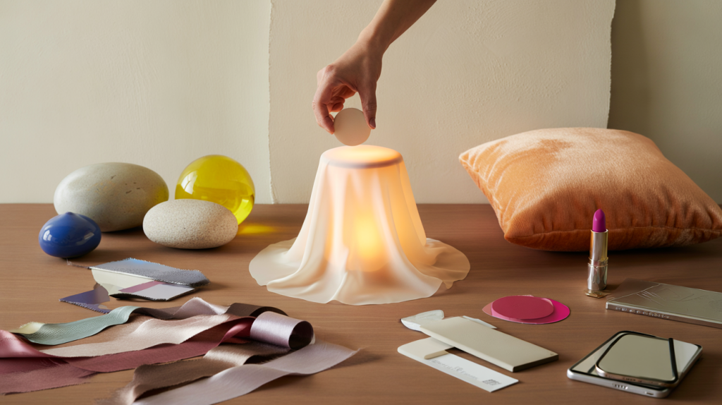
- Test in accents : cushions, lampshades, throws, phone cases and sneakers carry color with zero commitment.
- Sample paint : try swatches on a poster board, move it around the room at different times of day.
- Work with textures : velvet, boucle, glazed ceramic and powder coat each shift the same hue’s feel.
- Design digitally : build trial palettes in Pantone Connect, then translate to CMYK, RGB or Hex before buying.
- Think companions : pick two support colors in advance so the 2026 hue can slot in the middle of a trio.
- Plan seasonal edits : rotate accessories by quarter, not all at once, to follow the reveal without waste.
A practical example helps. If the final 2026 hue lands in a soft mid-tone family, pair it with a creamy off-white and a grounded brown for living spaces. If it turns out bold, flip the ratios: keep walls neutral, deploy the color in artwork and textiles, then echo it once in a vase or lampshade. The eye reads balance, not quantity.
For brand teams and creators, timing matters. Prep two adaptable key visuals now, each with a neutral skeleton. Once Pantone publishes the 2026 code, swap in the exact swatch and release campaign assets within days, not weeks. That speed often catches the Discover wave when searches spike right after the announcement date.
One last point on accuracy. The official name and code – PANTONE number included – only become definitive when Pantone publishes them. Watching Pantone’s newsroom and social feeds in early December remains the most reliable way to lock the final hue for 2026 without second guessing.