Pantone Color of the Year 2026: when the reveal lands, the signals to watch, and fast ways to apply the shade at home and in branding.
The design world is on alert. Pantone’s Color of the Year 2026 is expected to land in early December, the brand’s traditional reveal window that turns a single shade into a global headline. In recent years, the announcement dropped in the first half of December, like “Peach Fuzz” PANTONE 13-1023 on 7 December 2023 according to Pantone’s press release.
Why the buzz matters goes beyond paint chips. Pantone says more than 10 million designers and producers rely on its color systems for product decisions across fashion, beauty, tech, and interiors, a reach that shapes what sits on shelves and what fills feeds. The 2026 pick will move fast from runways to retail, so early context helps.
Pantone Color of the Year 2026: what we know and when it drops
Pantone usually unveils the next-year shade in December after a year of cultural and creative tracking by the Pantone Color Institute. The 2026 reveal sits on that same runway. Expect a precise color code, a name with a short narrative, and visual assets that ripple across brand decks within hours of publication.
Past timing sets the pace. “Viva Magenta” PANTONE 18-1750 arrived in December 2022, and “Classic Blue” PANTONE 19-4052 set the tone for 2020 after the December 2019 reveal, all noted by Pantone. The cadence helps marketers, retailers, and designers lock campaigns and assortments without guesswork.
There is one more constant. Pantone frames the pick as a snapshot of global mood and material innovation. The selection blends signals from entertainment, art, travel, socio economic shifts, tech, and new textures, a process the Institute outlines in its program notes.
How Pantone chooses a Color of the Year
The Pantone Color Institute tracks exhibitions, film, streetwear, viral imagery, and new manufacturing methods all year. Researchers scan for recurring hues and applications, then translate that into a single reference that designers can specify down to ink or pigment.
The approach can bend the rulebook. For 2022, Pantone created an entirely new hue, “Very Peri” PANTONE 17-3938, rather than selecting from the existing library, as recorded in Pantone’s 2021 announcement. That move signaled how emerging materials and digital life reshaped purple’s role.
The brand has also broken format with dual selections. In 2021, “Ultimate Gray” PANTONE 17-5104 and “Illuminating” PANTONE 13-0647 paired stability and optimism in one statement, confirmed in Pantone’s 2020 reveal notes.
Past Colors that set the tone, with dates and codes
Recent history offers clear markers that readers can verify fast. In 2024, “Peach Fuzz” PANTONE 13-1023 arrived on 7 December 2023 via Pantone’s press release and steered a soft, tactile aesthetic into beauty and interiors through 2024.
In 2023, “Viva Magenta” PANTONE 18-1750 leaned into saturated energy, published by Pantone in December 2022 with a focus on nature and tech interplay. The year before, “Very Peri” PANTONE 17-3938 defined 2022 as a bridge hue between physical and digital craft, the first newly created Color of the Year.
Roll back further and a calm marker appears. “Classic Blue” PANTONE 19-4052 anchored 2020 after the December 2019 reveal, a steady shade that brands adopted for trust and simplicity across packaging and UI.
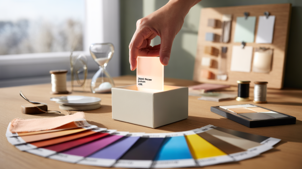
Practical ways to use Pantone’s 2026 shade fast
The question many teams ask today is simple. How to act before the market feels crowded. The answer starts with light, small pilots, and quick asset swaps that do not lock budgets for a full year.
Brand side teams often begin with digital. Update social templates and accents in email, then test engagement before rolling the color into hero images or packaging. Product teams can prototype trims, linings, or limited capsule drops to read demand in weeks, not quarters.
Home and hospitality usually start with textiles. Throws, cushions, napkins, and small decor carry a new hue without redoing paint or flooring. Retailers place endcaps or table edits a few days after the reveal to catch early curiosity while inventory remains flexible.
For context, Pantone’s global system reach – more than 10 million designers and producers, per Pantone – means suppliers already stock close matches by the time the press release hits. Speed comes from preparation, not rush.
Here is a compact checklist that works the day 2026 drops :
- Download Pantone’s official assets and the exact color code family for print and digital.
- Create one alt palette pairing that fits your brand’s current season, then A/B test.
- Swap secondary buttons, borders, or icons in UI to the new shade for one sprint.
- Brief retail or e-commerce to stage a small edit that tells a clear color story.
- Prototype trims or labels first, then expand to main body fabrics if KPIs lift.
- Prepare a press note that cites Pantone’s reveal date and code with no paraphrase.
One note on expectations. Until Pantone publishes the 2026 name and code, predictions are just noise. The useful move is to line up file presets, supplier swatches, and a flexible color pallete, then pivot the moment the Institute posts its announcement on pantone.com. That timing has held for years, and it keeps teams ahead without guessing.