Queen Letizia’s color-block outfits keep going viral. Discover how Spain’s queen turns bold hues into authority, the rules she follows, and how to copy the look.
One look, and the message lands. Queen Letizia of Spain steps out in crisp, high-contrast color-block, and the silhouette reads modern monarchy with zero fuss. Strong shades, clean lines, photo-ready impact : this is the royal styling move that keeps drawing clicks, street copies, and instant sellouts.
Context helps. Since becoming queen in 2014, Queen Letizia has built a wardrobe that mixes Spanish labels with smart tailoring and saturated tones. Color-blocking – the art of pairing large areas of solid, contrasting colors – gives her visibility in crowds, clarity on camera, and authority without a single extra embellishment.
Queen Letizia and color-block : why the formula works
The idea is simple : big planes of color do the talking. It started decades ago in fashion history with Yves Saint Laurent’s Mondrian dress in 1965, then returned to runways in Spring 2011 via power palettes at Jil Sander and Prada. Queen Letizia leans on that heritage and translates it for state duties, school visits, awards ceremonies.
There is logic behind the visuals. Bold pairings make it easier for photographers and audiences to spot a principal from a distance. A saturated skirt against a vivid blouse frames the face, keeps posture sharp, and respects protocol while feeling current. Spanish houses like Carolina Herrera and Massimo Dutti sit alongside Hugo Boss and Zara in this rotation, so the look travels from palace steps to everyday wardrobes.
The main tension many readers feel : loving vibrant colors, not knowing how to combine them without clashing. That is the problem this royal playbook quietly solves.
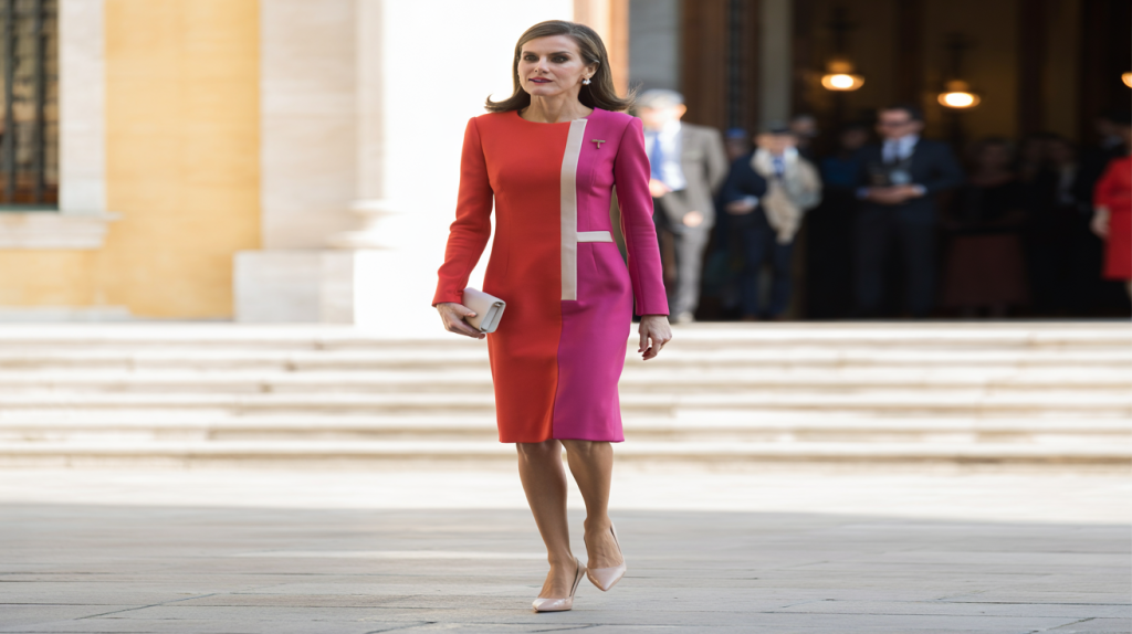
The rules behind royal color-block : hues, cuts, proportion
Start with structure. Queen Letizia chooses tailored jackets, pencil skirts, sheath dresses, or straight-leg trousers so the color stays crisp. No fussy details stealing focus. The shape carries the color.
Then, manage proportions. A classic guideline helps on busy mornings : the 60-30-10 rule. Let one dominant color take about 60 percent, a second shade 30 percent, and an accent 10 percent. Eyes relax, photos pop.
Color theory plays a quiet role. Complementary pairings across the color wheel – cobalt with orange, green with magenta – energize. Near neighbors – red with fuchsia, blue with teal – soften while staying bold. Queen Letizia often lands in that second family for elegance with bite.
Accessories stay almost invisible. Nude pumps, black slingbacks, or a compact clutch support the message without shouting. Jewerly stays minimal so the palette remains the headline.
Try this at home with a simple checklist :
- Pick two saturated shades you already love, then add a neutral shoe or bag.
- Keep lines clean : one tailored piece on top, one below, no extra frills.
- Apply 60-30-10 so the outfit breathes and feels intentional.
- Test in daylight : natural light reveals whether the colors sing or fight.
Key moments that set the tone for Queen Letizia
Her approach matured fast after 2014, when visibility and protocol moved center stage. The late 2010s brought a steady stream of red-with-pink, cobalt-with-navy, and emerald-with-cream looks that photographed sharply at ceremonies and daytime engagements.
Why it matters : high-contrast palettes read clearly across TV, print, and social feeds. For public figures, that clarity is currency. Designers have leaned into this need since 2011’s color-block revival, and the royal wardrobe simply put it to work with Spanish precision.
The cultural echo is real. Color-blocking taps optimism without slipping into trend-chasing. It respects tradition while keeping pace with contemporary workwear, which explains why these outfits keep trending in search and on shopping pages every season.
Shop the look on a real-life budget
The formula translates easily without a palace budget. Spanish high street brands deliver saturated blouses and pencil skirts every season, while mid-price tailoring nails the sharp lines that make color-blocking look expensive.
Build a two-piece kit first : a vivid top and a contrasting skirt or trouser. Add one neutral accessory you already own. Rotate the pieces with different partners for weekday variety without buying ten new things.
If in doubt, test a near-neighbor duo – say tomato red with fuchsia – then anchor it with nude shoes. It feels royal, reads fresh on camera, and solves that morning wardrobe debate in under five minutes.